Every day, millions of people move around the city to meet their daily needs. The routes taken by commuters differ widely, reflecting varying human activity patterns. Approximately 67% of Singapore’s population uses public transport, which includes bus and rail services1. Electronic public transport ticketing was introduced in 2001 with the EZ-Link fare card system, which generates data at the start and end of each trip. This creates an opportunity for urban planners to gain insight into how people travel and where they go to live, work and play.
The ability to distinguish commuters’ origins and destinations and where transfers between public transport services occur helps urban planners gauge the distribution of activities and flows of people across the island. Such insights have informed the siting of amenities and the design of pedestrian and cycling infrastructure.
Trip chaining
But before one can analyse the origin and destination information of commuters, one needs to consider trip chaining. This is the inclusion of intermediate stops on the way to a destination, for instance, dropping a child off at school on the way to work, or stopping at the mall to shop on the way home from work, Associate Professor Lynette Cheah, a researcher at the Engineering Systems and Design department of the Singapore University of Technology and Design, explains.
Trip chaining also includes linking up transfers made between different public transport modes such as from the bus to MRT during a journey. Understanding trip chaining can guide the development of policies concerning public transport, work schedules, and planning for peak travel, Dr Cheah adds.
Indeed, trip chaining is necessary to combine trips that are likely to be made for one journey to determine the true origin and destination of the commuter. Unfortunately, fare card data captures granular information on every trip made by bus or rail (i.e. origin, destination, trip start time, and trip end time) but does not contain information about the journey. Thus, some work needs to be done to deduce these true journeys.
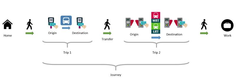
Figure 1: Illustration of a trip vs. journey from home to work
Identifying trip chaining
To be used in urban planning applications, transfers and journeys must be identified and isolated from public transport fare card data. To do this, URA set out to develop a method to carry out trip chaining. Transportation research typically assumes a 30 to 90 minute time difference between two trips to be considered as a transfer. However, environmental factors like the physical distance between transfer locations, operational factors such as the headway between services, and personal factors like individual walking pace, can affect the time required for transfers. Thus, there is a need to estimate the typical transfer duration for Singapore’s context.
The study mapped out the time difference between consecutive trips for each commuter at a particular MRT station and found that this time difference (or dwell time) is not proportionately distributed (Figure 2). The majority of commuters remained at the station for approximately 15 minutes, which is relatively short compared to the time spent by other commuters who remained in the vicinity for other activities. However, dwell times differed by location, hour of day and sequence of transfer between public transport services (Annex A). Hence, the next step was to attempt to identify a generalised dwell time value for Singapore.
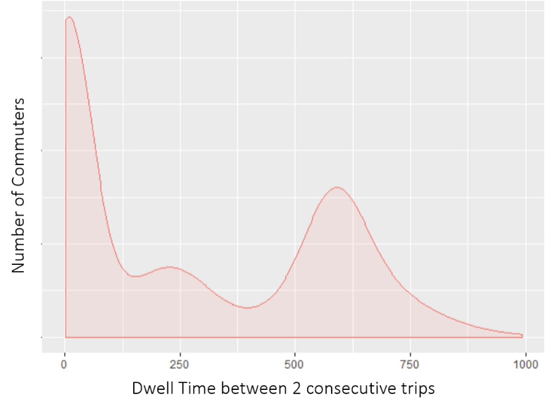
Figure 2: Dwell time (in minutes) between two consecutive trips at a residential MRT station (kernel density estimate)
The maximum transfer time allowed for public transport journeys in Singapore is 45 minutes. Focusing on activities that occur within this time period narrows the window to estimate the trip chaining parameter that best represents the time taken by commuters to transfer between public transport services directly. An analysis of trips made within 45 minutes shows a high proportion of commuters who had a dwell time of 10–15 minutes between two trips, followed by another peak at 40 minutes (Annex B).

The pathway between Tampines Bus Interchange and Tampines Mall (Image: Terence Ong, Wikicommons)
Land use factors, presence of facilities and amenities around the public transport node, as well as the hour of day influences the type of activities that occur, which in turn results in different dwell times (Annex C). Knowing the trip chaining parameter allows planners to distinguish direct transfers from other activities. As journeys derived from trip chaining exclude locations where commuters make transfers, the information captured will be more expressive of why people travel (Figure 3).

Figure 3: Trip chaining with estimated dwell time parameter t
There can be different trip chaining parameters for different bus stops surrounding an MRT station (see Annex D). Given that they are highly influenced by location, trip-chaining parameters should be done for every pair of stops to derive activity-based journeys with the best accuracy.
Public transport big data like EZ-Link data informs planners of general mobility patterns which they can then identify specific locations or times-of-day to conduct further micro-behavioural studies or to apply interventions, noted Associate Professor Wong Yiik Diew from the School of Civil and Environmental Engineering, Nanyang Technological University.
Greater clarity in the differentiation of trips and journeys, as a result of employing trip chaining, could aid in this process and lead to many applications, Dr Wong said.
Application 1: Planning of new cycling paths
EZ-Link data from the Land Transport Authority (LTA) shows that about 36% of all public transport journeys are shorter than 2 kilometres – largely intra-town trips to and from transport nodes such as train stations. These are trips that could potentially be made by cycling. A separate study was conducted to identify routes that could be converted into cycling paths.
With the use of network analysis, the shortest routes (e.g. blue line in Figure 4) between all origin-destination pairs were mapped. The study then attempted to determine commuters’ willingness to switch from public transport to cycling.

Figure 4: An example of the shortest route between two stops derived through network analysis
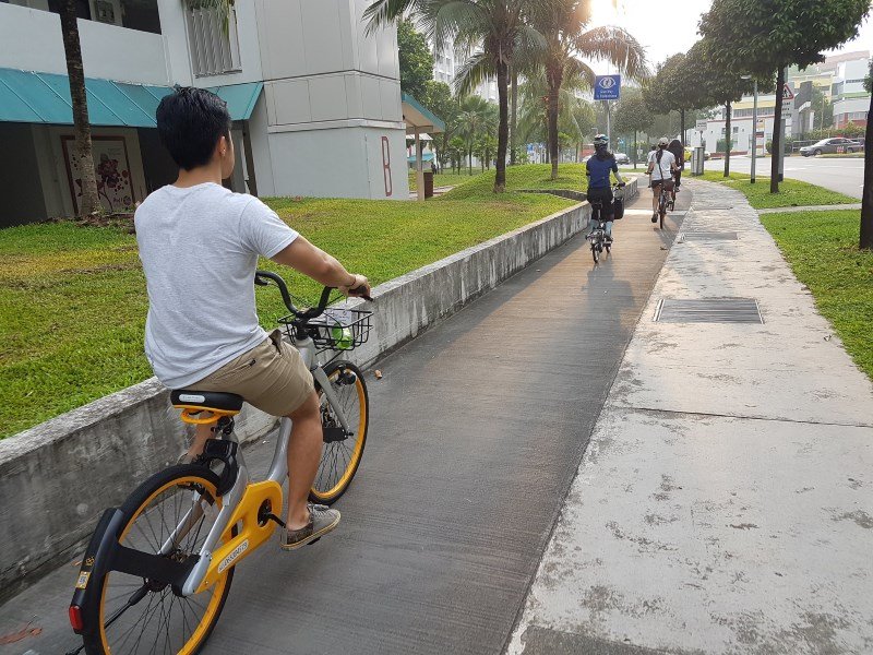
A cycling path in Tampines (Image: Chuwa, Flickr)
In general, the probability of a commuter converting to cycling would increase for shorter distances, and the conversion rate would fall more quickly with a higher decay coefficient, d (Figure 5). The detailed calculations for this conversion rate are explained in Annex E.

Figure 5: Rates of cycling conversion with varying decay coefficients
(View high-res image)
Multiple scenarios can be studied using varying parameters such as decay coefficients, d, or by analysing trips within (inter-town) and outside (intra-town) a selected area. By comparing results from different scenarios, planners can identify paths with high estimated cycling demand, as well as adjacent connecting pathways and cater infrastructure accordingly (Figure 6).

Figure 6: Estimated cycling demand based on scenarios with different d values and comparing intra and inter-town trips. Routes that constantly show up red under different scenarios reflect high priority for cycling infrastructure along those routes
Application 2: Transfer flow rate
Network analysis can be used to identify the shortest walking route for each origin-destination transfer, such as when one needs to walk from a bus stop to an MRT station to continue a journey. This represents the path commuters would most likely take to achieve the shortest travel time, where factors such as scenery and comfort have a lower priority.
Following Transport for London guidelines [3], the pedestrian flow rate of a path in 10 minutes (termed transfer flow rate) can be calculated using the following formula:

*Clear walkway width is the total width of the walkway minus the width of obstacles along the walkway
The transfer flow rate analysis informs planners of uncomfortable pedestrian paths with a high volume of commuter transfers. Interventions can then be made to improve the walking experience of pedestrians.

Figure 7: Transfer Origin-Destination pairs surrounding Tampines MRT station were used to map out the shortest paths and calculate the Transfer Flow Rate. This allows planners to identify pathways that have high pedestrian flows to implement interventions
(View high-res image)
Conclusion
Big data like public transport ridership reveals travel demand and this has traditionally been used for longer-term transport planning and the management of transport system operations in the short-term, says Dr Cheah. URA has taken on the challenge of using public transport data to extract insights on activity patterns, which contributes to smarter and more targeted urban planning.
In addition to public transport data, Dr Cheah pointed out that there are newer means of uncovering activity patterns through travel survey methods, or by interpreting activities through place types or social media data. These provide numerous opportunities for our planners as they continue to understand the city’s mobility flows and what drives them.
By Alvin Chua & Wang Songyu
URA would like to thank LTA for the sharing of anonymised EZ-Link data to support this analysis.
References
1. Ministry of Transport, “Making Public Transport the Choice Mode”. Retrieved November 28, 2019.
2. TransitLink, “Transfers”. Retrieved January 27, 2020
3. Transport for London, “Pedestrian Comfort Guidance for London”. Retrieved January 7, 2019.
The content in this article was abstracted from:
Wang, S.Y. et al., “Using Public Transport Smart Card Transaction Data for Active Mobility Infrastructure Planning”, 26th Intelligent Transport Systems World Congress (ITSWC), October 21–25, 2019, Singapore.
Chua A. et al., “Journey Estimation with Smart Card Data for Land Use Planning”, 3rd Asia Pacific Conference on Complex Systems Design and Management (CSD&M Asia), December 6–7, 2018, Singapore.
Annex A: Dwell times
In looking at dwell times at five different MRT stations, three peaks were identified: at the 15-minute, 240-minute and 540-minute marks. This shows the majority of commuters remained at the station for approximately 15 minutes, which is relatively short compared to the time spent by other commuters who remain in the vicinity for activities that take longer [i.e. the 2nd and 3rd peaks at the 240th minute (4th hour) and 540th minute (9th hour)], implying recreational and work-related activities respectively.
Figure 1 shows that transfer time is highly variable. Durations differ by location, hour of day and sequence of transfer (i.e. from bus to rail, bus to bus, rail to bus, etc.).
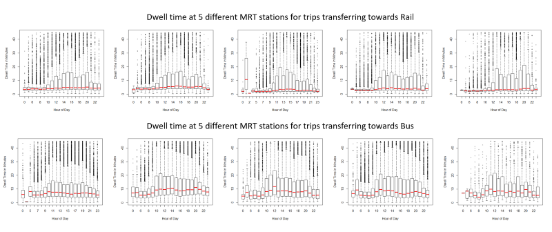
Figure 1: Hourly breakdown of dwell time distributions at five residential town MRT stations. The red line indicates the median dwell time for each hour of the day
(View high-res image)
Annex B: Analysis of trips within 45 minutes
An analysis of trips within 45 minutes shows a high proportion of commuters who had a dwell time of 10–15 minutes between two trips, followed by another peak at 40 minutes (Figure 1).
The first peak on the left of the distribution comprises MRT transfers while the second peak, at the 40-minute mark, could be due to short activities like having a quick meal, buying food or walking to a nearby childcare centre.
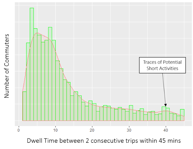
Figure 1: Histogram and kernel density estimate of dwell time (≤ 45 minutes) at an MRT station
Annex C: Generalised dwell time
A generalised dwell time parameter can be estimated based on the characteristics of the distribution of dwell times with the formula below:


Figure 1: Illustration of the formula for trip chaining parameter estimation
Annex D: Multiple trip chaining parameters at one location
Sometimes, there are many bus stops surrounding a MRT station where commuters transfer to or from bus and train services. Most commuters who alighted from Yishun MRT station board the next bus from bus stop locations shown in Figure 1, including Yishun Bus Interchange (59009), which has the highest number of commuters.

Figure 1: Locations of bus transfers near Yishun MRT
In the estimation of dwell time for all bus stops from Yishun MRT, the average dwell time parameter is 12 minutes. However, when looking at specific bus stops, the estimated parameter becomes 15 minutes for Yishun bus interchange (59009), which is located 500 metres from the station, and 7 minutes for bus stop 59079, which is right below the station.

Figure 2: Changes in dwell time parameters at different levels of data granularity
Annex E: Conversion rate to cycling
A proxy P = e-dDmwas used to estimate commuter desire to cycle based on cycling distance derived from network analysis. The probability (P) for a commuter to convert to cycling was estimated using a decay function based on the distance of the potential cycling route (D) with a variable decay coefficient (d) and a cap conversion rate of m%.
In general, the probability of a commuter converting to cycling increases with a shorter cycling distance, and conversion rate would fall more quickly with a higher decay coefficient (Figure 1).

Figure 1: Proxy P = e-dDm showing falling percentage conversion with increasing decay coefficient, d
Source: https://www.ura.gov.sg/Corporate/Resources/Ideas-and-Trends/Understanding-Urban-Activity-and-Mobility-Patterns


